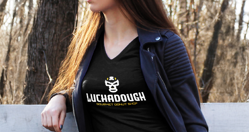
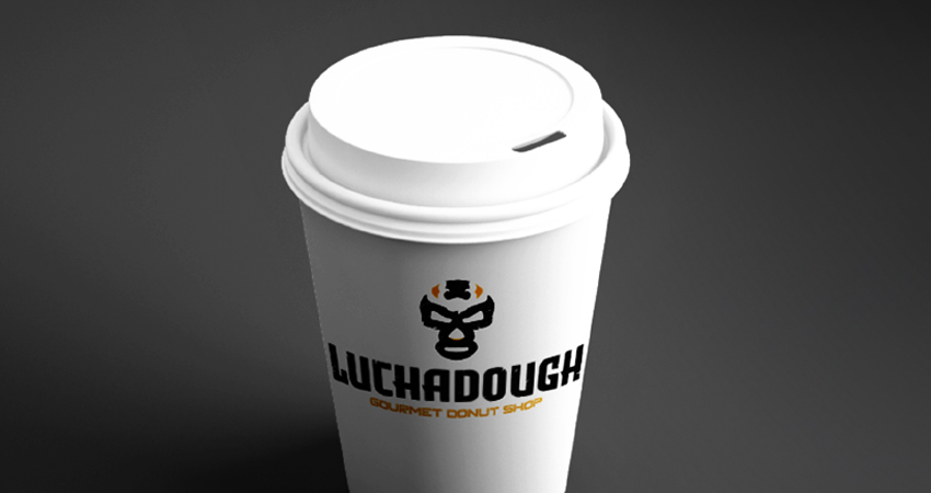
Luchadough is a gourmet doughnut startup created by a friend. I don’t typically offer my design work pro bono, but in this case, I had the dual satisfaction of supporting my friend’s dream while at the same time creating a logo design with wrestling. This was a fun design!
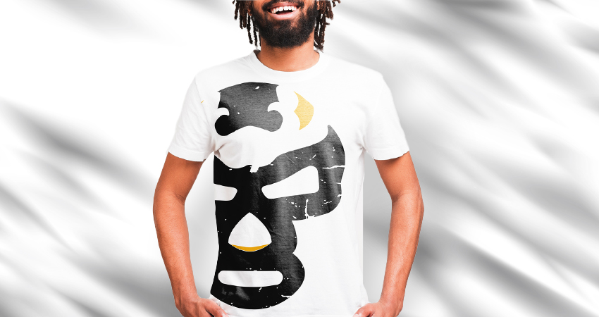
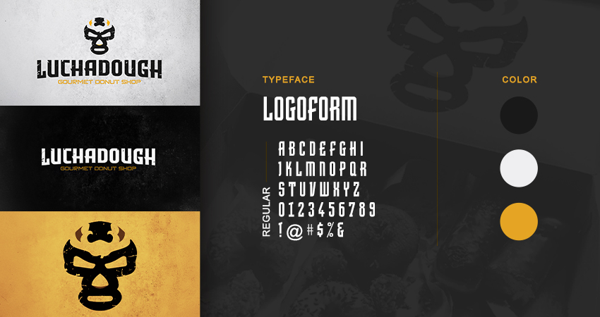
The challenge was to create a logo that incorporated something reminiscent of the world of professional wrestling. As a lifelong wrestling fan, I had a blast with this. Basically, I created a logo mark that was a simplified representation of a Luchador mask. Luchadoughs are Mexican wrestlers, who wow audiences around the world with their athletics and colorful attire. Given that the word Lucha was within the name of the brand, this was a perfect fit for the iconography of the logo design. The typography was meant to be rugged and with plenty of personality. I gave the entire logo design a finish that made it look worn and scraped up. All of it was meant to vibe with the identity of wrestling as a whole. Black and yellow made for a badass color scheme that supported the entire theme.
In the years since, Luchadough has moved on to a different look and feel as its services evolved. Regardless, it’s a logo that I’m proud of and didn’t think twice about featuring in my portfolio.