Shaping Something Meant to Last
A Place In Time was already doing meaningful work way before I came into the picture. The ministry had grown organically through years of service, driven by the vision and perseverance of its founder, Tricia Heng. By the time I started working with Tricia, she was ready to bring structure and clarity to a brand she had built from the ground up. She wanted the visual presentation of the ministry to have the same level of thoughtfulness she weave into every other aspect.
This project unfolded during a pivotal moment. Tricia understood the importance of defining what she had created, not just for the present, but for the future. What we worked on together became less about branding and more about authorship. It was about helping someone translate years of lived purpose and hard work into a branding system that would endure the test of time. In time truly was at the heart of more than just a ministry name, as would later become clear.
A Place In Time
Client Name
Nonprofit Community Organization
Industry
Brand Strategy & Graphic Design
My Role
Non-Profit President Tricia Heng
Team
The Journey
The focus of this project was to bring branding structure to a growing non-profit organization with multiple initiatives operating under one umbrella. The goal was to create a unified system that honored each program’s independence while reinforcing a shared identity rooted in service, dignity, and great design.
Challenge
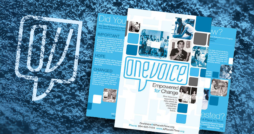
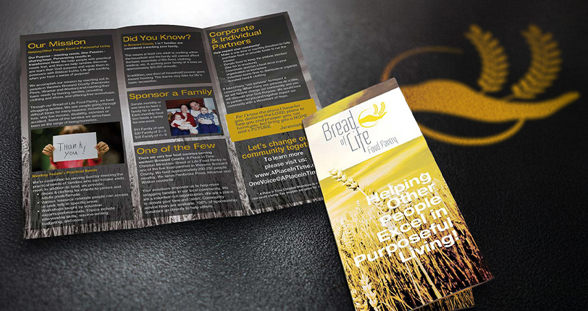
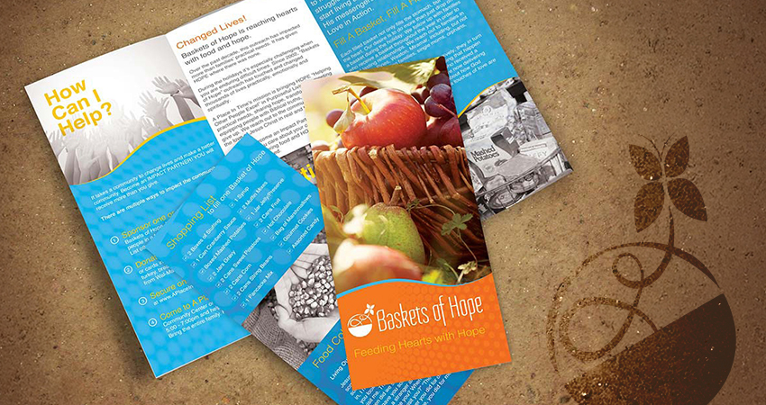
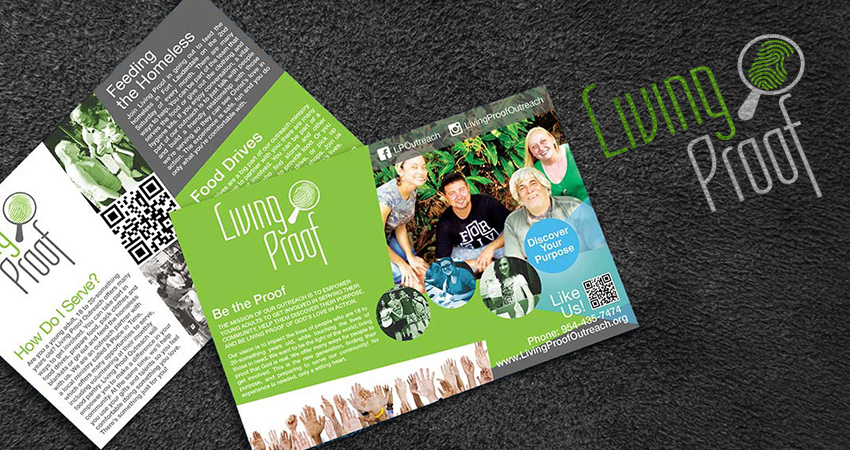
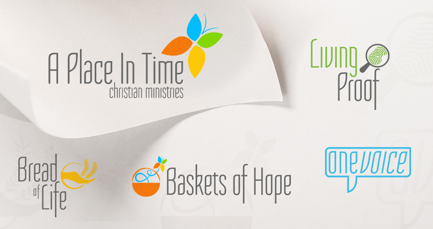
Over time, A Place In Time had expanded into several distinct programs: Baskets of Hope, the Bread of Life Food Pantry, a teen volunteer initiative, and a young adult group had all emerged naturally. Each served a different audience, yet there was no clear framework tying them together. The organization needed a way to clearly represent these branches while tying back to the mother brand. I needed to deliver a primary logo, logos and print materials for each program, and eventually a website design.
Strategy
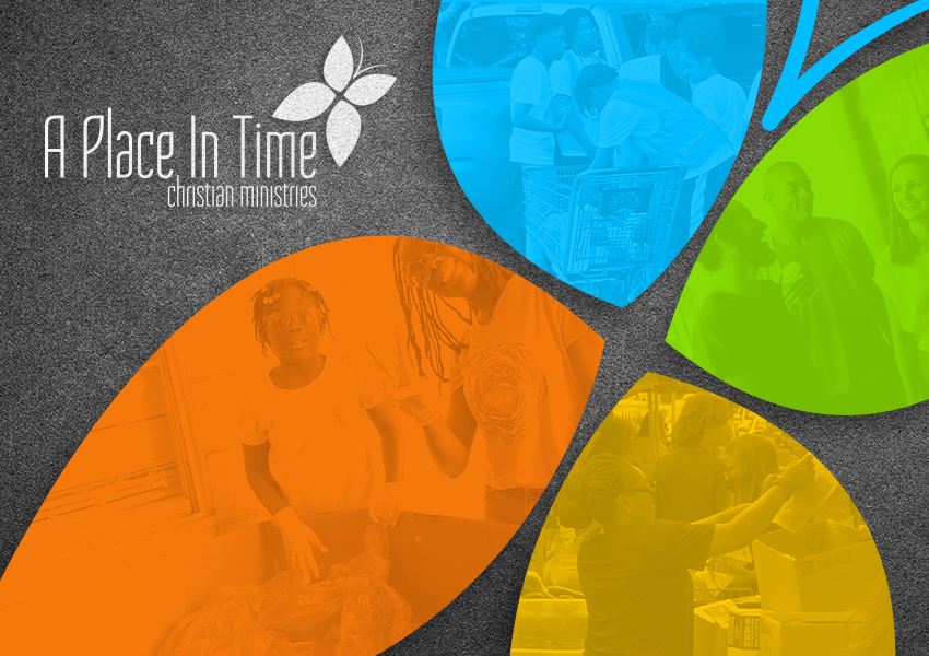
I approached the challenge by designing a house of brands rather than fully distinct, standalone logos. Typography and color palette became the unifying backbone. Each program would utilize the same typographic foundation. The mother brand for A Place In Time would feature a butterfly mark symbolizing transformation and growth, with each wing section color representing a different program within the whole. Each division of the ministry would be assigned one of those colors to dominate its own identity.
Results
The final system gave A Place In Time a clear visual structure that allowed each initiative to operate with autonomy while remaining visibly connected. Let’s say pornography was modern and unique. The color palette was vibrant and hopeful. The branding was positioned to bring clarity to internal organization, strengthen communication, and create a foundation for growth. Sadly, the website phase was never realized, but the identity system still stands to this day.
Contributing to Legacy
What I’m Most Proud Of
This project became meaningful to me in ways I couldn’t have anticipated at the time. Shortly after we completed the identity system and print materials, Tricia sadly passed away. If you read The Human page on this website, you’ll learn that I hold the concept of leaving a legacy very highly. After Tricia’s passing, I realized that I had contributed a small piece to the large puzzle that was her life’s work. But an important piece.
I check in on A Place In Time from time to time. Every time I see the branding I created still going strong, I feel that I’m helping keep Tricia Heng’s legacy alive. I was part of someone else leaving a mark. Being trusted with that responsibility is something I’ll always carry with me.

Project Deliverables
These materials reflect the foundational brand system created for A Place In Time, including the parent identity and the individual program marks, color systems, and supporting print pieces.