A Place in Time is a long-standing nonprofit serving families, seniors, and individuals in need across Broward County through food access, clothing support, and community-based care. At the time of my work with them, the organization had grown organically over the years, with multiple programs emerging to meet real needs. They needed a brand system that could unify those efforts under one recognizable umbrella while allowing each program to retain its own identity.

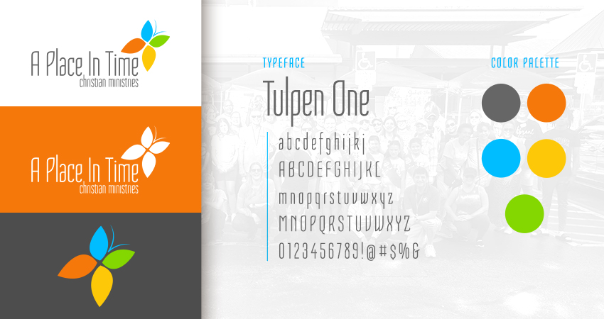
The core challenge was creating a mother brand that could house and represent each of the programs that make up the organization, while allowing room for their individuality. I tied the system together through shared typography and color strategy, using the typeface Tulpen One across all marks and a 4-hue color scheme, with each color representing one of the four programs. The primary logo for the nonprofit included the butterfly, with each section of the wings, housing one of the four colors.

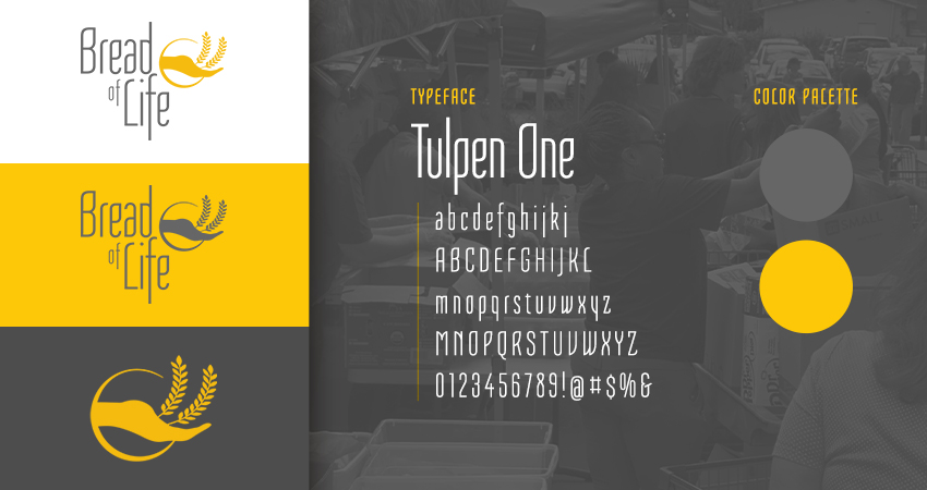
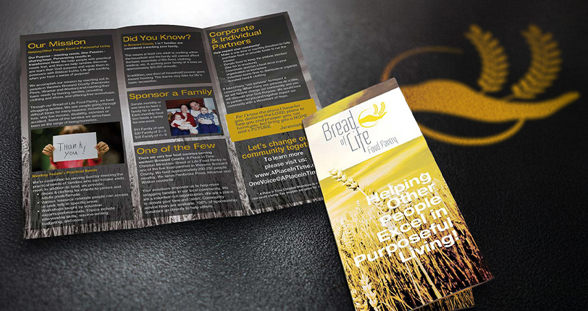
After the primary logo was finalized and approved, they moved on to the logos for each program. Bread of Life, the food pantry program in the ministry, would inherit the yellow color and feature an icon with a hand offering up stalks of wheat.
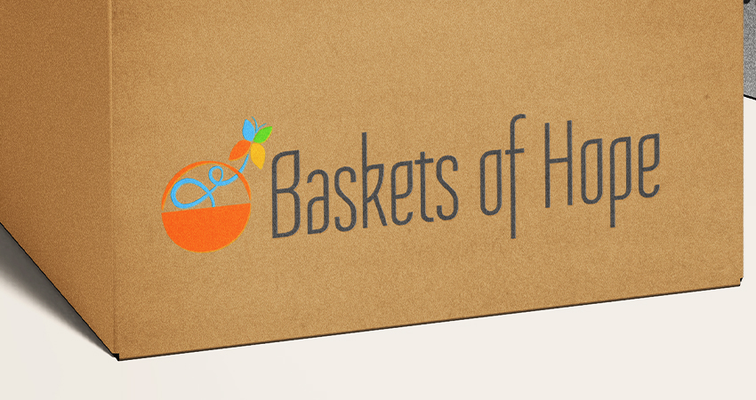
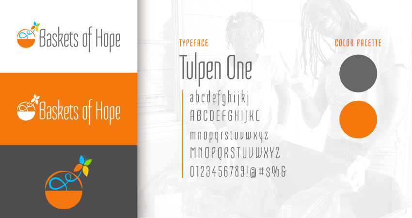
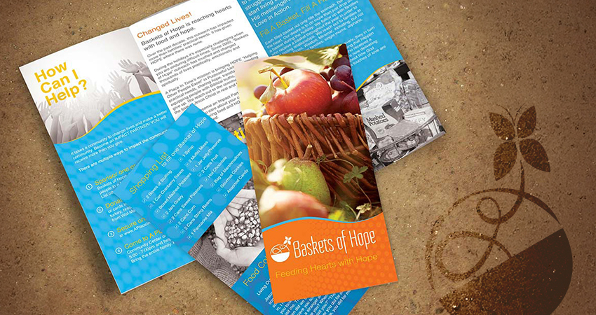
Baskets of Hope, the donation program, would inherit the orange color as its primary and feature a custom-made logo mark with the main logos butterfly emerging from a basket.

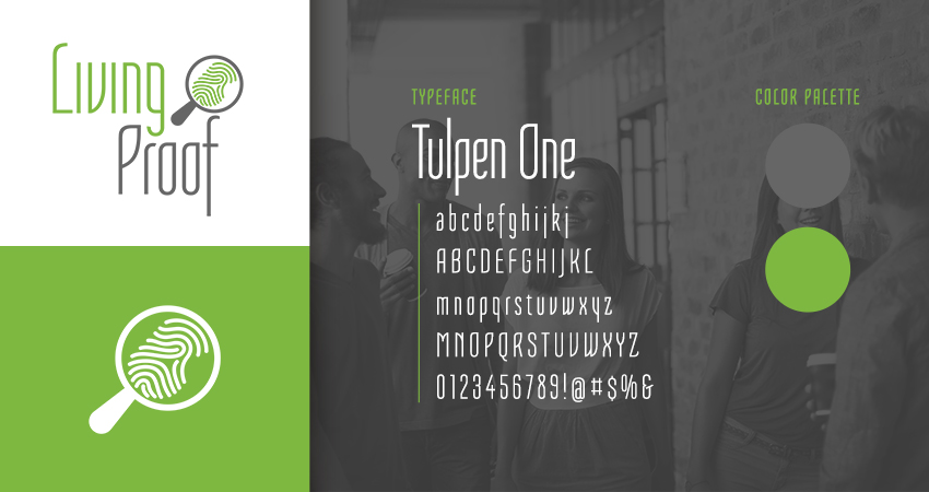
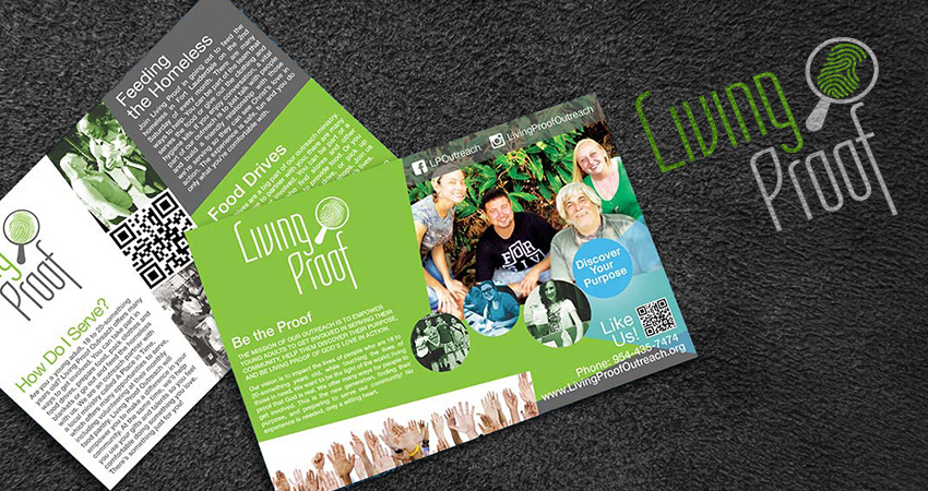
Living proof, the young adults program, will inherit the green color and feature a magnifying glass with a fingerprint in focus, civilizing the fact that once faith is made visible by how it impacts the way we live.


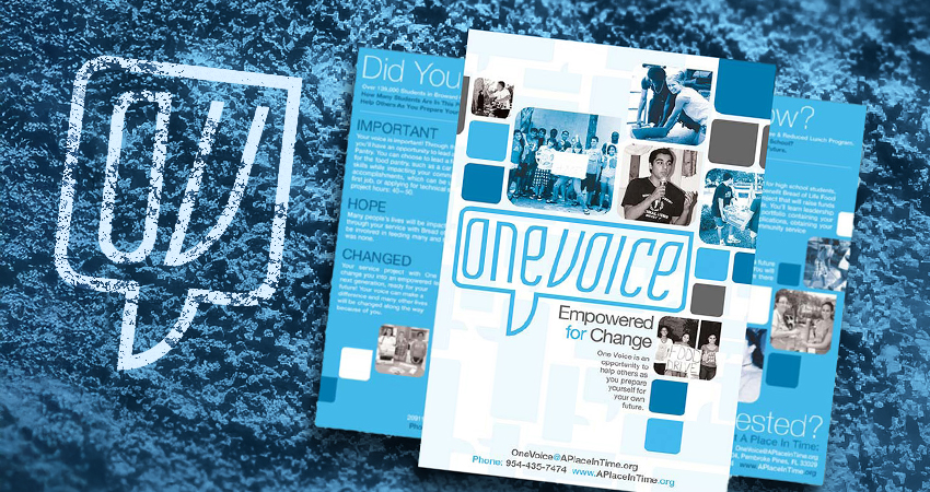
The fourth program, one voice, was the teen group. This logo would inherit the blue color and in case the wordmark inside of a speech bubble, meant to represent the sharing of life through fellowship at a young age, while alluding to the growing use of text messaging and social media during that time, period.
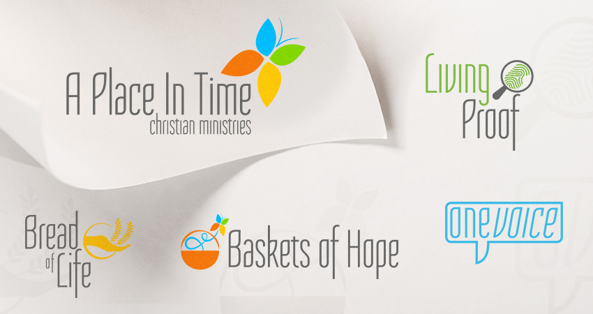
The result was a cohesive family of brands that feel related at a glance, flexible in use, and clear in how they support the broader mission of A Place In Time. If you want to learn more about the broader project, check out the case study.
Related Samples for A Place In Time