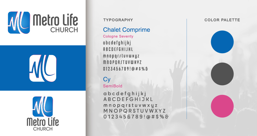
Metro Life Church is a Miami based church community focused on building meaningful relationships within the congregation and extending care beyond its walls. Under new leadership, the church embraced a more contemporary direction rooted in the belief that people, not buildings, are the true heartbeat of the community. Pastor David Roman explained that the brand needed a logo that felt modern and energetic while expressing connection, movement, and shared life.
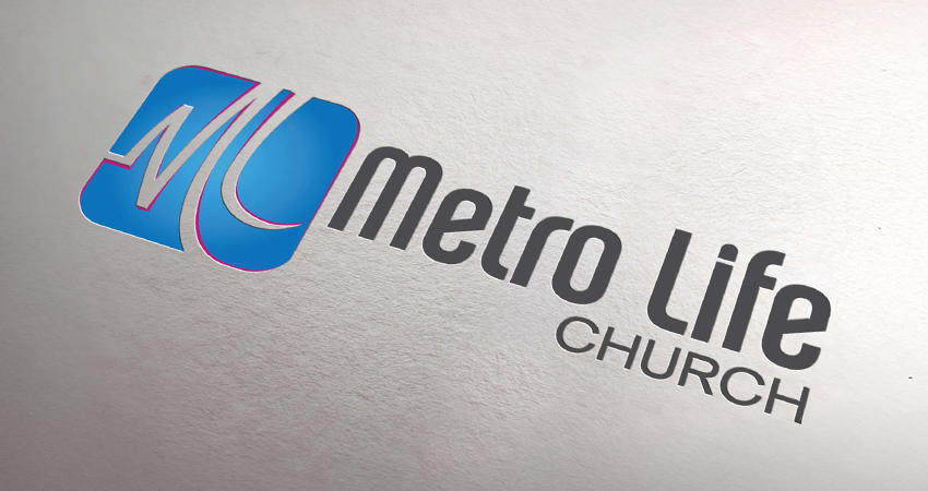
They came in wanting a visual identity that moved away from traditional church symbols and avoided anything rigid or institutional. I explored ways to embed meaning directly into the letterforms, ultimately shaping the M and L into an implied heartbeat line that referenced both community and presence without being literal.
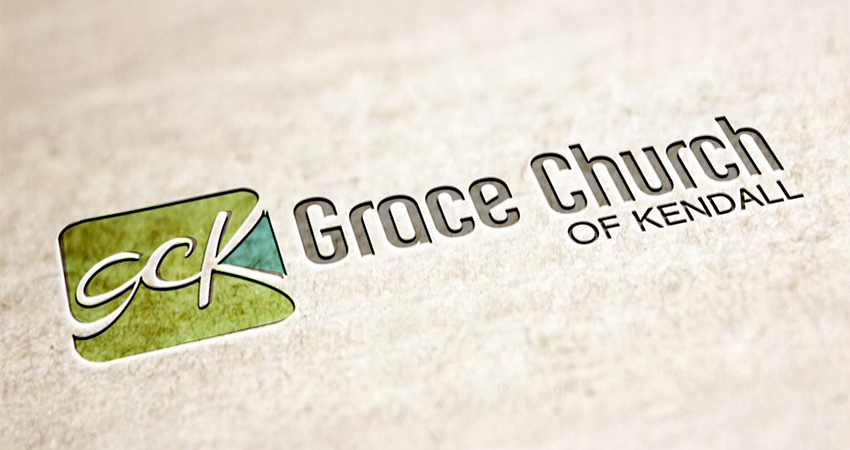
After the design of the primary Metro Life Church logo, I designed a logo for their sister church Grace Church of Kendall. This mark was meant to draw inspiration from the primary design, while giving that its own color palette. The final marks feels personal and alive, pairing vibrant blue and magenta tones with a form that continues to represent the church even as other elements evolve.