
The branding for Business Watch Tampa was meant to balance out the seriousness of the initiative with the warmth of the intent behind it. The blue was a natural color to serve as a base given the connection to Tampa Police; however, the yellow brought about a balance invoking the warmth of the Tampa Bay area.
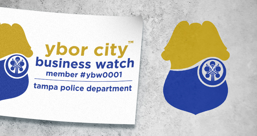
The replacement of the “U” with the badge shape was a direct homage to the iconic shape of the Tampa Police badges.
If you wanna learn more about the entire project, click below to check out the case study.
Related Business Watch Samples